Funded
Designing a Marketplace App for Scholarship Discovery
Funded is an online marketplace designed to connect scholarship seekers with relevant scholarships. By providing a personalized feed of opportunities tailored to individual needs and attributes, Funded aims to streamline the scholarship application process and increase accessibility for everyone.
The
Challenge
I needed to design an interface capable of managing a large volume of data while providing personalized and accurate scholarship matches. Connecting users with the right scholarships was only part of the challenge; the application process also needed to be intuitive to encourage user engagement. Additionally, the marketplace had to cater not only to those seeking scholarships but also to those offering opportunities.
The
Solution
To address these challenges, I designed a user-friendly interface inspired by leading marketplace platforms, incorporating proven features and UI elements. I developed tailored functionalities for both scholarship seekers and providers: seekers could create customized profiles and receive personalized notifications, while providers had a dedicated portal for managing and reviewing applications. This approach ensured a smooth and efficient experience for all users.
My
Role
In my role as the UX/UI Designer, I used the user research provided by the clients to design both desktop and mobile interfaces.
Project
Duration
2
Weeks
Tools
Used
Discover
Phase
I began with a one-hour workshop with the client to gain a clear understanding of their business objectives and the product. During the session, I asked a series of questions, sketched wireframes on the whiteboard, and listed the features required on each page.
The client provided me with research on their target audience, which they had gathered through surveys and interviews with both scholarship seekers and scholarship providers.
Business Objectives
- Secure Funding for Development: Create a compelling prototype that illustrates the platform’s unique value proposition to attract investors and secure funding.
- Validate Market Demand: Showcase user interest and engagement metrics, and collect user feedback.
- Establish Partnerships: Present the prototype to potential investors to foster relationships and secure partnerships.
- Create a Visual and Brand Identity: Develop a brand identity that resonates with the target audience and enhances credibility.
Target Audience
Among the many potential users, the client identified five primary ones:
Scholarship Seekers
High school graduates
Undergraduates
Researchers
Scholarship Providers
Independent Providers
Educational Institutions
General Tasks
- Sign up and set up a new user (either as seeker or provider).
- View scholarships tailored to the users unique attributes.
- Search and find scholarships.
- Manage scholarship applications (as a provider)
Brand Style
- Friendly and Encouraging Language: Use a conversational and upbeat tone that resonates with students and reflects the client’s personality. Incorporate slang and relatable humor where appropriate, while maintaining professionalism.
- Fun and Trustworthy Feel: Combine fun accent colors with a clean, professional layout and design. Ensure the design communicates reliability and credibility while keeping the overall vibe engaging.
Competitor
Analysis
I requested that the client identify key competitors offering services similar to Funded. Additionally, we explored various marketplace websites with interfaces similar to our vision for Funded.
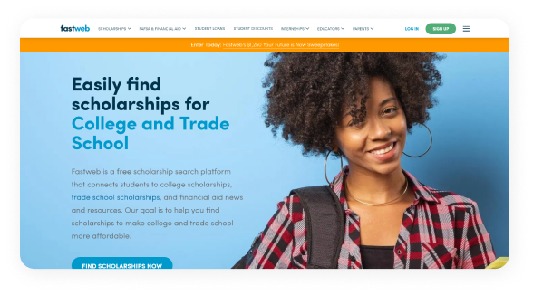
Fast Web
Fast Web is a free scholarship platform that connects students with a variety of scholarships, financial aid news, and financial resources.
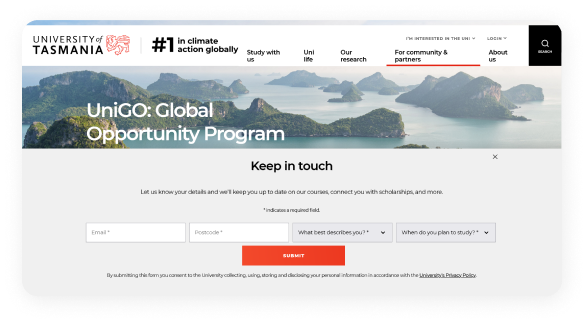
UniGo
UniGO is a scholarship platform that enables students to apply for scholarships, save essay questions, and access financial resources.
Seek
While Seek focuses on careers, its UX principles are effectively adaptable to a scholarship marketplace.

Research Insights
- Users frequently find existing scholarship applications lengthy and challenging to navigate.
- There is a gap in the market for a platform that can customize a diverse range of scholarships for various user types.
- Users often struggle with managing and organizing multiple scholarship applications and deadlines.
- Providers face challenges in reaching potential candidates and ensuring their opportunities are visible to the right audience.
- While competitors offer valuable services, they lack advanced features such as personalized recommendations, streamlined application management, and an intuitive interface.
- Many existing platforms are not optimized for mobile use.
- Users prefer platforms that offer customized scholarship matches based on their profiles and preferences, minimizing the need for manual searching.
- A significant number of users access scholarship information via mobile devices, highlighting the need for responsive design.
- However, they often use desktops for applying and mobile devices for viewing listings.
Define
Phase
Following the discovery phase, I moved to the defining phase, where I synthesized the collected insights to establish a clear understanding of user needs and project goals.
User
Persona
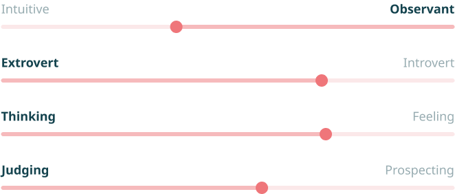
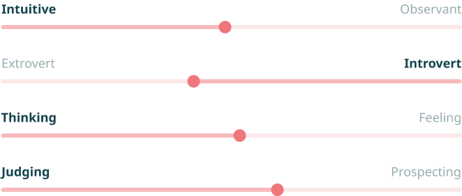
Using the data gathered from the interviews, I developed one user persona for the scholarship seeker and one for the scholarship provider. I used these personas to ensure that the users’ needs were considered throughout the design process.

Age 20
Status Single
Major Environmental Science
Education Undergraduate (1st Year)
“To truly focus on my education and make an impact in my field, I need financial support to cover my living expenses and expert guidance to navigate the scholarship application process.”
Alex Martinez
The Undergraduate Student
Personality
Behaviour
- Spends considerable time researching various scholarship opportunities, focusing on those aligned with their field of study.
- Regularly checks scholarship websites, university portals, and professional networks for new opportunities.
- Utilizes task management apps to keep track of application deadlines, required documents, and essay drafts.
- Manages time effectively, prioritizing academic responsibilities.
- Competently engages with technology on a regular basis for academic tasks.
Needs
- Living expenses to cover costs such as housing, groceries, and other daily needs.
- Clear and concise information on application requirements and deadlines.
- Constructive feedback on application from advisors and mentors.
Goals
- Secure a scholarship to alleviate the financial burden of tuition and other educational expenses.
- Enhance academic and professional credentials to increase opportunities for internships and future employment in the environmental field.
Frustrations
- Navigating the scholarship application process, which may include preparing essays, gathering recommendation letters, and meeting various deadlines.
- Juggling academic responsibilities, extracurricular activities, and scholarship application process while maintaining a healthy study-life balance.
- Uncertainty about which scholarships are best suited to their background
Sarah Campbell
The Financial Aid Officer
Age 32
Status Married
Job Title Financial Aid Officer
Goals
- Enhance outreach efforts to ensure that all eligible students are aware of and can apply for available scholarships.
- Simplify and improve the scholarship application and review process to make it more efficient for both applicants and the scholarship team.
- Maintain and build strong relationships with scholarship donors to ensure ongoing support and satisfaction.
“It’s hard to keep everything organized and understand all the legal stuff, but my main focus is making sure my kids have what they need and that they’re taken care of.”

Behaviour
- Meticulously reviews scholarship applications and verifies eligibility manually.
- Uses checklists, calendars, and tracking systems to stay on top of deadlines and processes.
- Actively seeks out ways to improve the scholarship process and is quick to implement new strategies.
- Provides personal support and encouragement to help students navigate the financial aid process.
Personality
Frustrations
- Ineligible applicants applying for scholarships.
- Managing multiple scholarships with varying criteria and application requirements.
- Managing applications through email, which quickly becomes disorganized and is time-consuming.
Needs
- An efficient, user-friendly system for managing scholarship applications that minimizes manual processing.
- An effective tool for marketing scholarships to potential applicants.
- A tool for organizing and analysing application data, tracking scholarships and maintaining accurate records.
Brand
Style
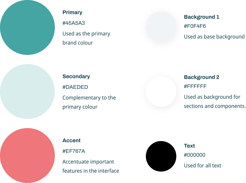
Colour Palette
I chose green as the primary color for its vibrant, friendly, and reliable qualities. The pink accent adds a youthful, playful touch when used sparingly, enhancing the interface without overwhelming it. To ensure clarity and readability with these bold colors, the majority of the interface features neutral tones. This balance creates a professional yet lively atmosphere, blending fun with effective communication.
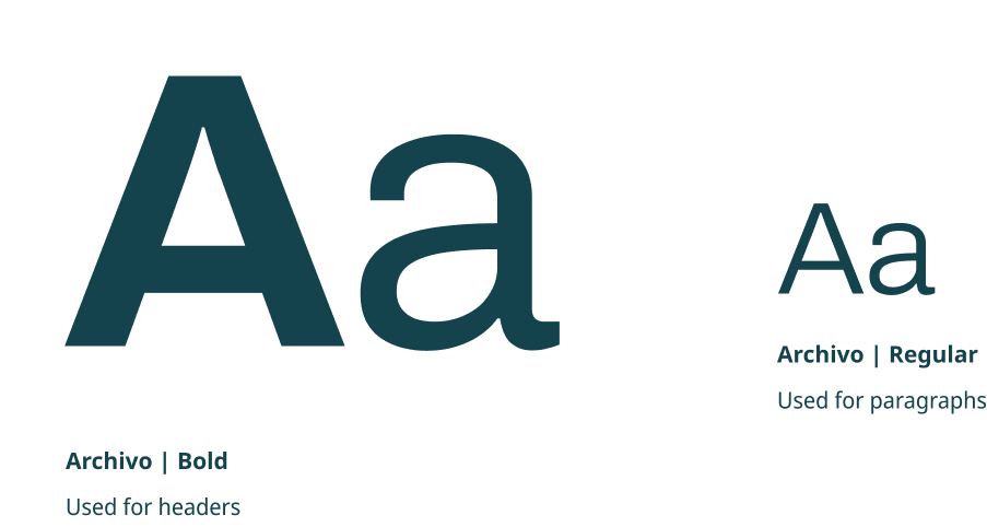
Typography
I chose Archivo as the font for its clean, professional appearance and excellent readability, ensuring clarity across various screen sizes and devices. Overall, Archivo aligned with our goal of delivering a user-friendly and approachable interface.
Design
Phase
I started with a one-hour workshop with the client to gain a clear understanding of their business objectives and the product. During the session, I asked a series of questions, sketched wireframes on the whiteboard, and listed the features required on each page.
The client provided me with research they had conducted on their target audience through surveys and interviews, including insights from both scholarship seekers and scholarship providers.
The
Wireframes
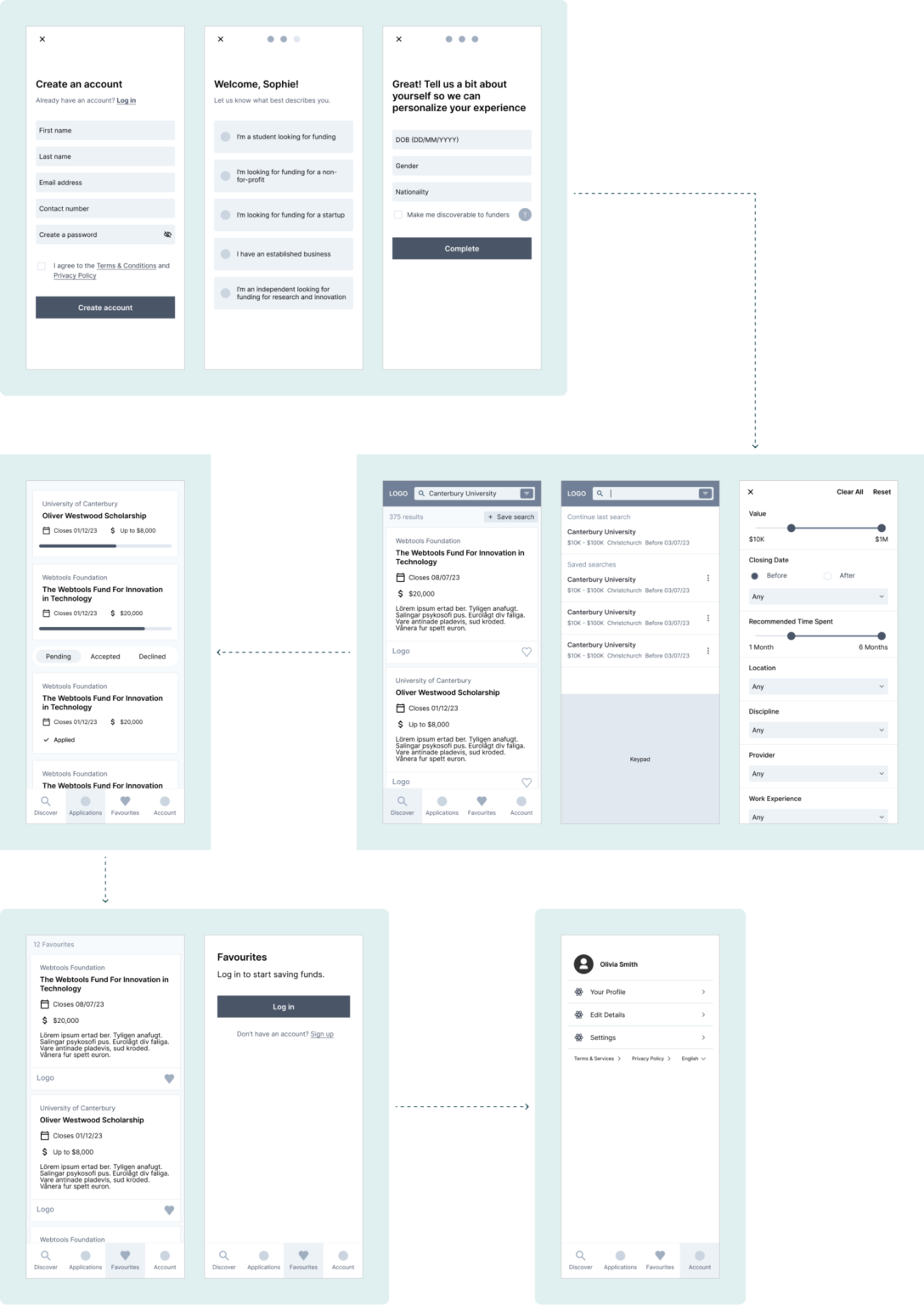
I began the design phase by sketching low-fidelity wireframes on paper for the key pages. I then used these initial sketches to create high-fidelity wireframes in Figma.
High
Fidelity
The feedback from the wireframe workshop was incorporated into the high-fidelity design, along with the visual style. During the high-fidelity design process, I also included intermediate pages and examples of state variations.
Onboarding
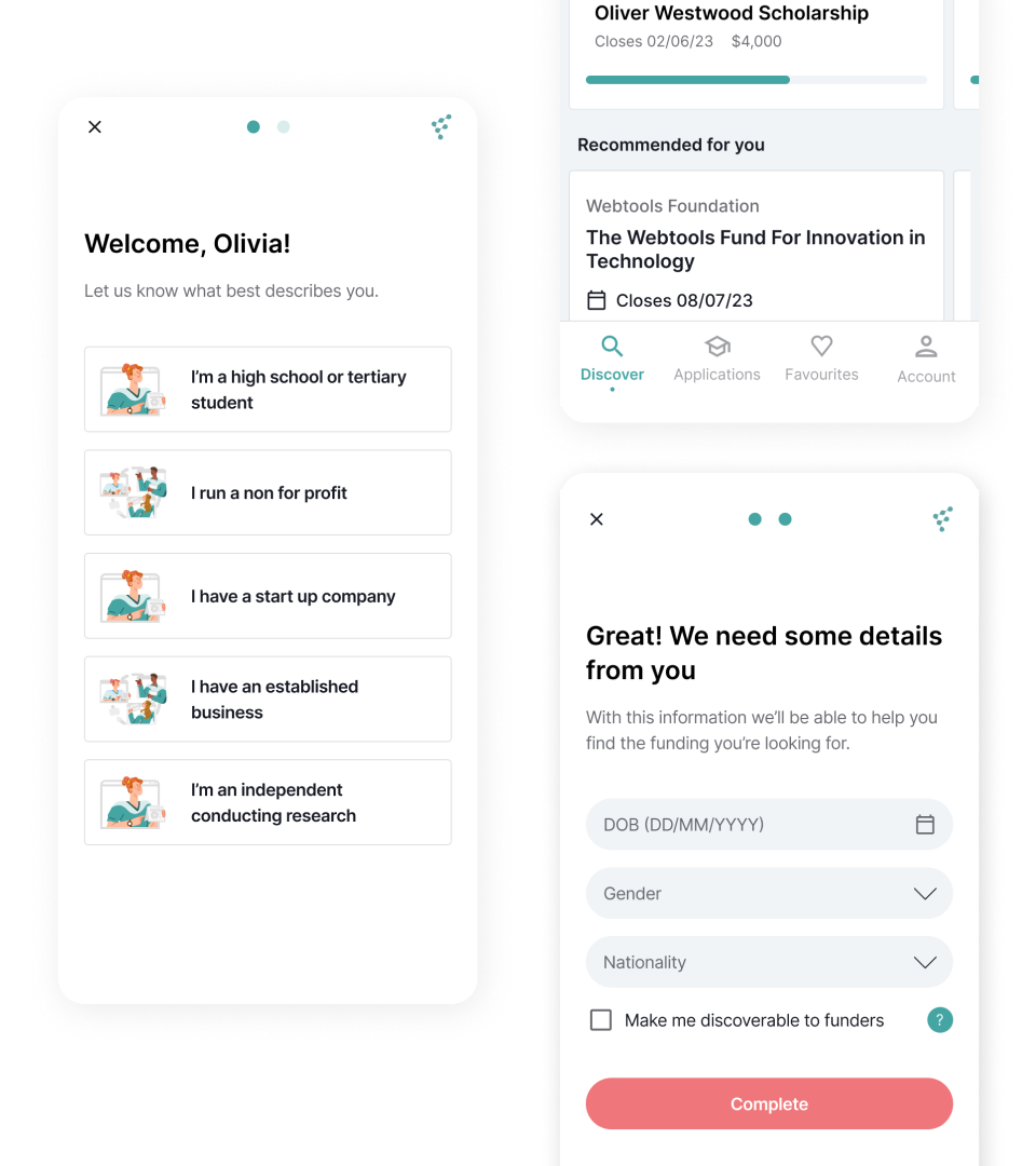
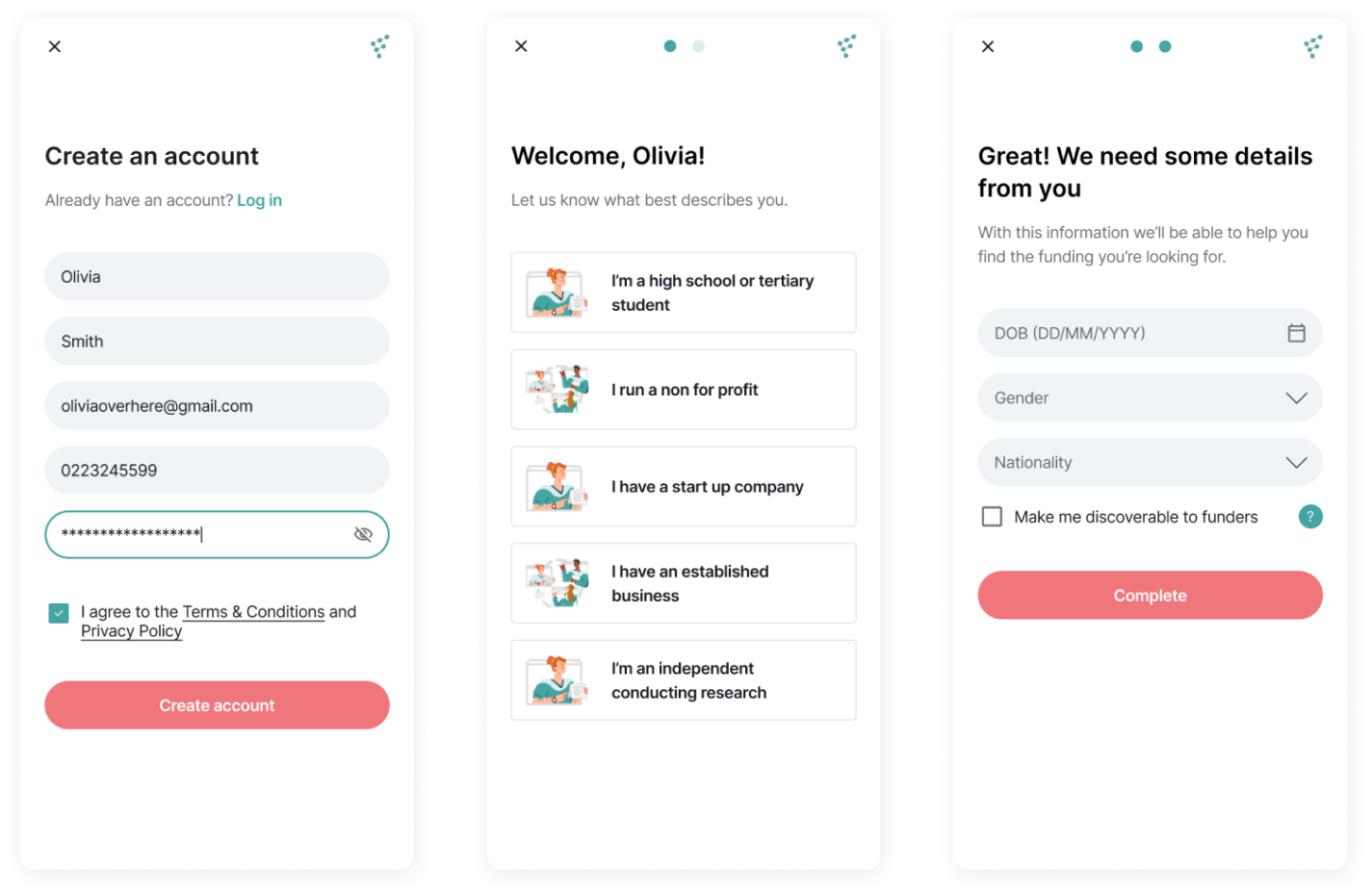
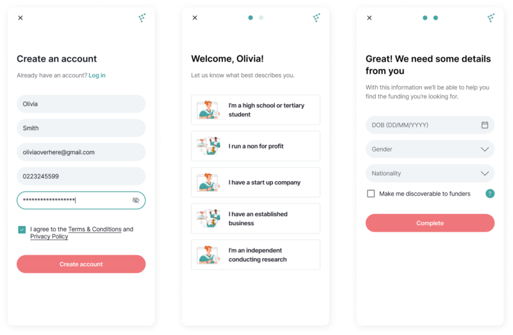
The app requires personal details to tailor the experience and prevent ineligible fund applications. To streamline onboarding and enhance user-friendliness, I divided it into sections and provided an option to skip to the dashboard. However, most features remain locked until users create an account, motivating them to complete the registration. This approach simplifies onboarding and reduces friction between the user and the product.
Discover
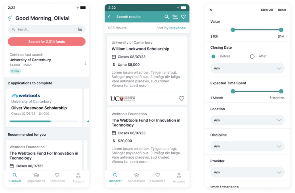
For account holders, the discovery page automatically shows funds they qualify for by default. Users can customize this view using search filters, clear all filters, reset to personalized settings, and save their searches. Essential fund details are displayed, with options to view more information or add funds to their favorites.
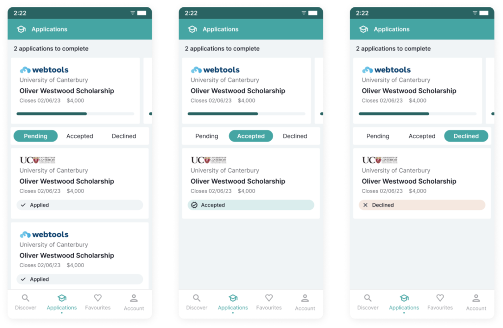
Applications
Users can view all their applications on this page, with incomplete applications prominently displayed at the top as the primary call-to-action. Each submitted application is clearly labeled with its status—pending, accepted, or declined.
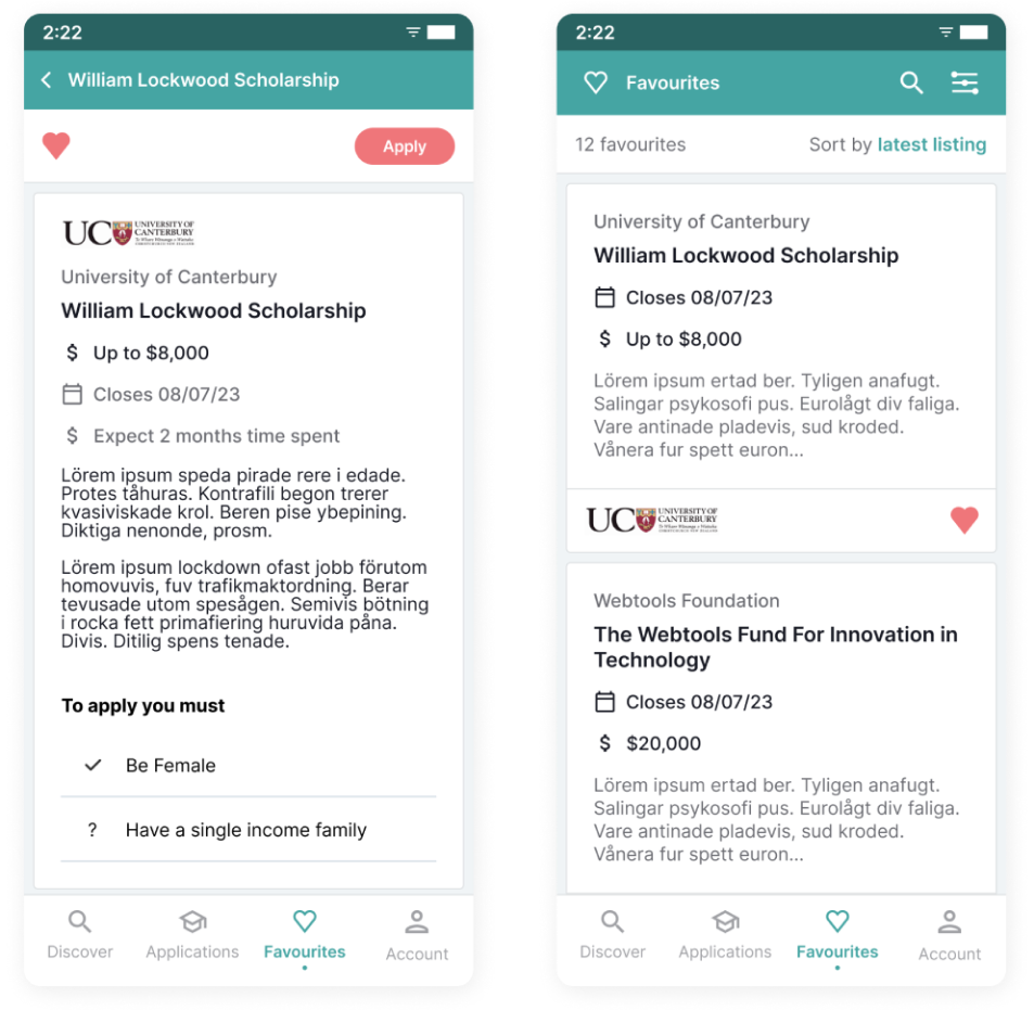
Favourites
The Favorites section of the app allows users to save applications they’re interested in for easy access later. By bookmarking these applications, users can quickly revisit and manage their preferred options, streamlining their decision-making process.
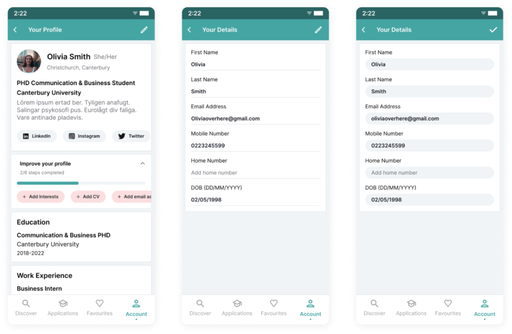
Accounts
The account page provides users with a comprehensive view of their application progress, allowing them to track the status of their submissions. Users can also create and update a profile for review by educators. Additionally, the page allows users to modify their account and profile information, ensuring their details remain current and accurate.